

UI Concepts Framework · CHAPTER 5 OF 8
The colour system

Step 5 Define the Colour System
Organise Colours by Their Type
Once the moodboard and overall direction are confirmed, define the colour system.
Start with the brand guidelines, but do not use every brand colour across the entire interface.

Flows
Data
Access
Intuative
Tasks
Prior
Users
Organise Colours by Their Type
Once the moodboard and overall direction are confirmed, define the colour system.
Start with the brand guidelines, but do not use every brand colour across the entire interface.
Flows
Data
Access
Intuative
Tasks
Prior
Users
A Brand Palette Is Not a UI Colour System
Colours should be organised based on the role they play within the software.
A UI colour system usually includes:
- Primary colour
- Secondary colours
- Tertiary colours
- Semantic colours

A Brand Palette Is Not a UI Colour System
Colours should be organised based on the role they play within the software.
A UI colour system usually includes:
- Primary colour
- Secondary colours
- Tertiary colours
- Semantic colours
Primary Colour
Primary Colour
Use the Primary Colour Selectively




Use the Primary Colour Selectively
Telangana Electricity App Example
For one Telangana Electricity App concept, blue was used as the primary colour because it communicates:
- Trust
- Reliability
- Professionalism
Instead of applying it everywhere, use it for key actions such as: Pay Bill, Continue, Get Started, Active navigation, Selected states







Choose Renewable
Get your connections be powered by the sun today!

Read more





Home

Services

Complains
Telangana Electricity App Example
For one Telangana Electricity App concept, blue was used as the primary colour because it communicates:
- Trust
- Reliability
- Professionalism
Instead of applying it everywhere, use it for key actions such as: Pay Bill, Continue, Get Started, Active navigation, Selected states
Choose Renewable
Get your connections be powered by the sun today!
Read more
Home
Services
Complains
Secondary Colour
Secondary Colour
Support the Primary Colour







Support the Primary Colour
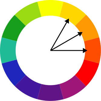
Control Supporting Colours
Green, red, and yellow may appear in the supporting palette.
Their use should depend on the meaning and context of each colour rather than decoration.

Control Supporting Colours
Green, red, and yellow may appear in the supporting palette.
Their use should depend on the meaning and context of each colour rather than decoration.
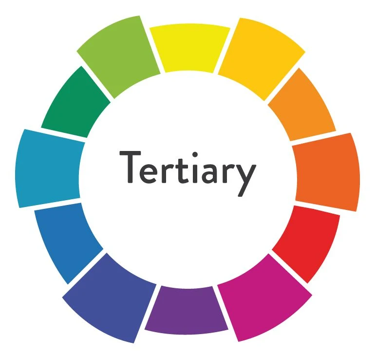
Tertiary Colour
Tertiary Colour
Use Neutrals to Create Structure






Use Neutrals to Create Structure
Balance Stronger Brand Colours
In the Telangana Electricity App:
Light greys support backgrounds and cards
Dark neutrals support headings, labels, and body text
Subtle borders separate information
This keeps the interface clean and readable.
Choose Renewable
Get your connections be powered by the sun today!
Read more
Home
Services
Complains
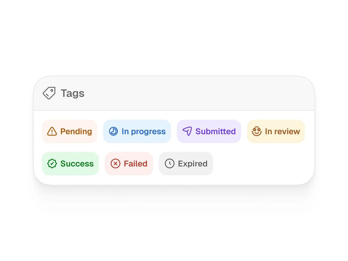
Semantic Colours
Semantic Colours Improve Scanning


Semantic Colours Improve Scanning
Do Not Display the Brand Colour Everywhere





Do Not Display the Brand Colour Everywhere
Handling Different Brand Palettes
What If the Logo Has Multiple Colours?
When a logo contains multiple colours, assign each one a clear role.
For the RanaBOM concept:
Brown was used as the primary colour
Blue was used as the secondary colour
For each selected colour, we created a tonal palette and chose the most suitable shades for the interface.
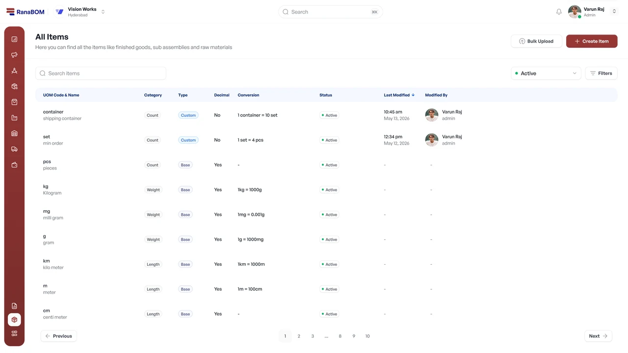


What If the Logo Has Multiple Colours?
When a logo contains multiple colours, assign each one a clear role.
For the RanaBOM concept:
Brown was used as the primary colour
Blue was used as the secondary colour
For each selected colour, we created a tonal palette and chose the most suitable shades for the interface.
What If the Logo Uses a Gradient?
A gradient does not need to appear across the entire interface. Use it selectively for secondary elements, highlights, illustrations, or branded moments.
In AssetWyn, we selected two key colours from the logo gradient, created a tonal palette for each, and chose suitable shades for the interface.
This maintained the brand connection without overwhelming the UI.


by


What If the Logo Uses a Gradient?
A gradient does not need to appear across the entire interface. Use it selectively for secondary elements, highlights, illustrations, or branded moments.
In AssetWyn, we selected two key colours from the logo gradient, created a tonal palette for each, and chose suitable shades for the interface.
This maintained the brand connection without overwhelming the UI.
by
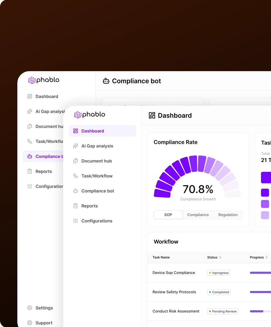
What If the Client Wants a Monotonous Look?
Some B2B SaaS clients prefer a restrained, single-colour direction.
In this case, select one base colour, create a tonal palette from it, and choose suitable shades for the interface.
Semantic colours should remain separate for success, warning, error, and information states.
Dashboard
Ai Gap analysis
Document hub
Task/Workflow
Compliance bot
Reports
Configurations
Settings
Support
Compliance bot
Olivia Rhye
olivia@untitledui.com
Compliance Rate
70.8%
Compliance Growth
SOP
Compliance
Regulation
Task Status
This Month
Total
21 Tasks
Completed
10/20
Inprogress
07/20
Pending
03/20
Compliance Bot
Hi how can i help you with
compliance?
Ask about compliance....
Workflow
Filters
Task Name
Device Sop Compliance
Review Safety Protocols
Conduct Risk Assessment
Update Security Policies
Implement Data Protection
Status
Inprogress
Completed
Pending Review
Rejected
Rejected
Progress
60%
100%
30%
10%
10%
Due date
Jan 16, 2025
Jan 16, 2025
Jan 14, 2025
Jan 14, 2025
Jan 14, 2025
Regulatory Watchtower
REG-KNOW-STD
"Source Monitoring","Obligations Registry"
New update V2.12
REG-KNOW-STD
"Source Monitoring","Obligations Registry"
New update V2.12
REG-KNOW-STD
"Source Monitoring","Obligations Registry"
New update V2.12
REG-KNOW-STD
"Source Monitoring","Obligations Registry"
New update V2.12
Dashboard
Ai Gap analysis
Document hub
Task/Workflow
Compliance bot
Reports
Configurations
Settings
Support
Dashboard
Olivia Rhye
olivia@untitledui.com
Compliance Rate
70.8%
Compliance Growth
SOP
Compliance
Regulation
Task Status
This Month
Total
21 Tasks
Completed
10/20
Inprogress
07/20
Pending
03/20
Compliance Bot
Hi how can i help you with
compliance?
Ask about compliance....
Workflow
Filters
Task Name
Device Sop Compliance
Review Safety Protocols
Conduct Risk Assessment
Update Security Policies
Implement Data Protection
Status
Inprogress
Completed
Pending Review
Rejected
Rejected
Progress
60%
100%
30%
10%
10%
Due date
Jan 16, 2025
Jan 16, 2025
Jan 14, 2025
Jan 14, 2025
Jan 14, 2025
Regulatory Watchtower
REG-KNOW-STD
"Source Monitoring","Obligations Registry"
New update V2.12
REG-KNOW-STD
"Source Monitoring","Obligations Registry"
New update V2.12
REG-KNOW-STD
"Source Monitoring","Obligations Registry"
New update V2.12
REG-KNOW-STD
"Source Monitoring","Obligations Registry"
New update V2.12
What If the Client Wants a Monotonous Look?
Some B2B SaaS clients prefer a restrained, single-colour direction.
In this case, select one base colour, create a tonal palette from it, and choose suitable shades for the interface.
Semantic colours should remain separate for success, warning, error, and information states.
Dashboard
Ai Gap analysis
Document hub
Task/Workflow
Compliance bot
Reports
Configurations
Settings
Support
Compliance bot
Olivia Rhye
olivia@untitledui.com
Compliance Rate
70.8%
Compliance Growth
SOP
Compliance
Regulation
Task Status
This Month
Total
21 Tasks
Completed
10/20
Inprogress
07/20
Pending
03/20
Compliance Bot
Hi how can i help you with
compliance?
Ask about compliance....
Workflow
Filters
Task Name
Device Sop Compliance
Review Safety Protocols
Conduct Risk Assessment
Update Security Policies
Implement Data Protection
Status
Inprogress
Completed
Pending Review
Rejected
Rejected
Progress
60%
100%
30%
10%
10%
Due date
Jan 16, 2025
Jan 16, 2025
Jan 14, 2025
Jan 14, 2025
Jan 14, 2025
Regulatory Watchtower
REG-KNOW-STD
"Source Monitoring","Obligations Registry"
New update V2.12
REG-KNOW-STD
"Source Monitoring","Obligations Registry"
New update V2.12
REG-KNOW-STD
"Source Monitoring","Obligations Registry"
New update V2.12
REG-KNOW-STD
"Source Monitoring","Obligations Registry"
New update V2.12
Dashboard
Ai Gap analysis
Document hub
Task/Workflow
Compliance bot
Reports
Configurations
Settings
Support
Dashboard
Olivia Rhye
olivia@untitledui.com
Compliance Rate
70.8%
Compliance Growth
SOP
Compliance
Regulation
Task Status
This Month
Total
21 Tasks
Completed
10/20
Inprogress
07/20
Pending
03/20
Compliance Bot
Hi how can i help you with
compliance?
Ask about compliance....
Workflow
Filters
Task Name
Device Sop Compliance
Review Safety Protocols
Conduct Risk Assessment
Update Security Policies
Implement Data Protection
Status
Inprogress
Completed
Pending Review
Rejected
Rejected
Progress
60%
100%
30%
10%
10%
Due date
Jan 16, 2025
Jan 16, 2025
Jan 14, 2025
Jan 14, 2025
Jan 14, 2025
Regulatory Watchtower
REG-KNOW-STD
"Source Monitoring","Obligations Registry"
New update V2.12
REG-KNOW-STD
"Source Monitoring","Obligations Registry"
New update V2.12
REG-KNOW-STD
"Source Monitoring","Obligations Registry"
New update V2.12
REG-KNOW-STD
"Source Monitoring","Obligations Registry"
New update V2.12
Choose the Direction Based on Context




Choose the Direction Based on Context
Colours Checklist

The Final Check Before moving to next process

Have you understood:
Is the primary colour clearly defined?
Are secondary colours controlled?
Are neutral colours available?
Are semantic colours consistent?
Does the palette align with the brand?
Does it meet accessibility requirements?
The Final Check Before moving to next process
Final Step-5 Takeaway
Use Colour With a Clear Purpose
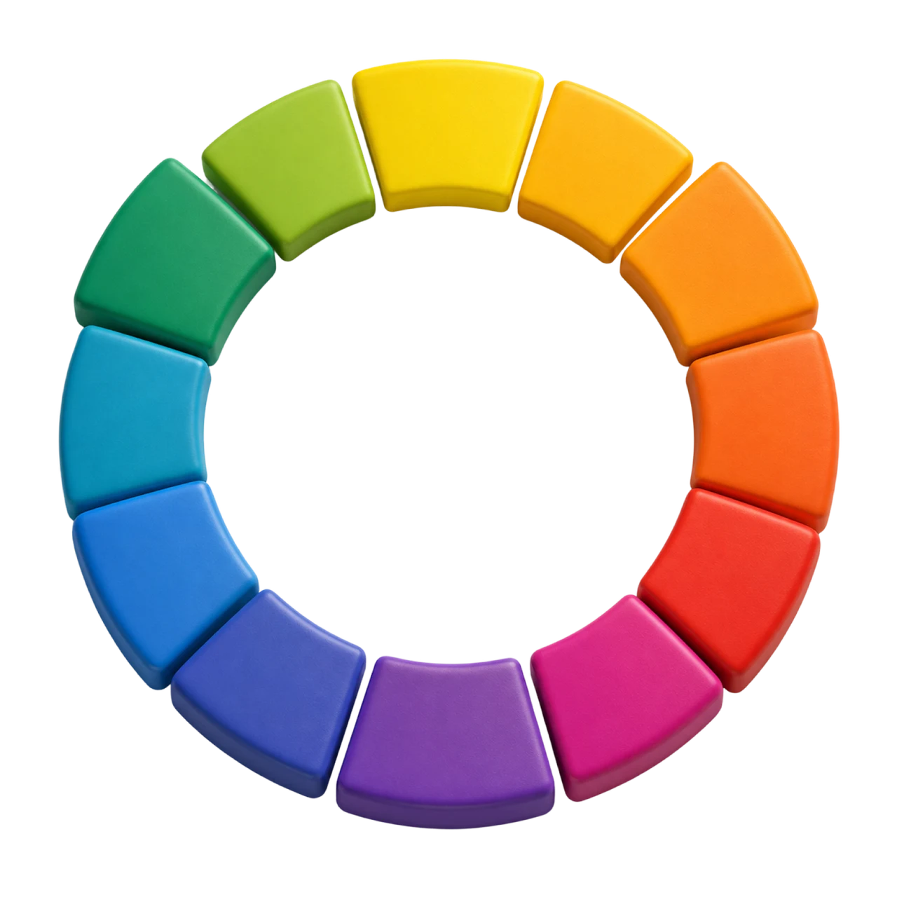
A strong colour system connects the brand with the interface while creating hierarchy, readability, and meaning.

Final Step-5 Takeaway
Use Colour With a Clear Purpose
A strong colour system connects the brand with the interface while creating hierarchy, readability, and meaning.